Description
A Comprehensive Exploration of Business Firm Logo Design
Introduction
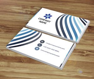
A logo is often the first thing a customer notices about a business — and sometimes the only thing they remember. It’s more than a picture next to a company name; it’s a compressed signal of trust, quality, and personality that has to work in a fraction of a second, whether it’s on a storefront sign, a business card, or a tiny app icon. In this guide, we break down what actually makes a business firm logo design effective, how logo design has evolved, and what to keep in mind if you’re creating — or refreshing — your own.
Why Logos Matter for a Business
Brand Identity and Recognition
A logo acts as visual shorthand for everything a brand stands for. Once customers see it enough times in the right context, they don’t need to read the company name — the shape and colors alone trigger recognition.
Trust and Credibility
A polished, professional logo signals that a business pays attention to detail — and by extension, that it can be trusted to deliver on its promises. A rushed or inconsistent logo does the opposite, even if the product behind it is solid.
Standing Out in a Crowded Market
In categories where dozens of competitors look similar, a distinctive logo is often the tie-breaker that helps a customer recall — and choose — one brand over another.
Communicating Values Without Words
Color, typography, and shape all carry meaning before a single word is read. A rounded, playful wordmark says something very different from a sharp, geometric one — and the best logos choose that language deliberately.
How Logo Design Has Evolved
Business marks aren’t a modern invention — traders and medieval guilds used simple symbols to identify their goods centuries ago. What’s changed is the context they have to work in.
From Ornate to Simple
Early 20th-century corporate logos leaned heavily on intricate illustration and detailed typography. By the mid-1900s, designers like Paul Rand pushed the industry toward cleaner, simpler marks — a shift that produced many of the logos we still recognize instantly today.
Designing for Every Screen
The biggest recent shift is responsiveness. A logo now has to hold up as a 16px favicon, a full-width website header, and a printed sign — often all on the same day. That constraint has pushed logo design toward simpler, more scalable shapes.
Core Principles Behind Strong Logo Design
- Simplicity — Easier to recognize at a glance, and easier to reproduce cleanly at any size.
- Memorability — Achieved through a distinctive shape, smart use of negative space, or an unexpected detail that sticks.
- Versatility — Should look right on a business card, a billboard, and a mobile screen without losing clarity.
- Relevance — The style should actually match the industry and audience — a law firm and a children’s toy brand shouldn’t use the same visual language.
How the Logo Design Process Actually Works
1. Brief and Research
Good logos start with understanding the business, not the design software. Designers study the client’s positioning, audience, and competitors before sketching anything.
2. Sketching and Concepting
Multiple rough directions are explored on paper or in low-fidelity digital sketches — this is where the widest range of ideas gets tested cheaply.
3. Digital Refinement
The strongest concept is rebuilt as clean vector art, tested at different sizes, and refined in color and typography.
4. Feedback and Iteration
Client feedback shapes the final direction — this stage is less about “adding more” and more about cutting anything that doesn’t earn its place.
5. Finalization and Handoff
The finished logo is delivered with usage guidelines — color codes, clear space, and file formats — so it stays consistent everywhere it’s used.
Logo Trends Worth Knowing
Minimalism remains dominant, but a few specific patterns stand out right now: fully responsive logos that simplify automatically on small screens, custom lettering that turns a brand name itself into a distinctive mark, and geometric shapes used to signal precision and structure.
What Iconic Logos Get Right
Apple proves that a single, simple silhouette can carry decades of brand meaning. Nike’s swoosh does more with one curved line than most logos do with a dozen elements. McDonald’s golden arches show that boldness and simplicity travel across languages and cultures without translation. Google’s playful, color-shifting mark signals flexibility — a brand comfortable reinventing its own visual identity.
Frequently Asked Questions
How much should a small business spend on a logo?
It depends on the stage of the business — a startup testing an idea can start with a free tool, while an established brand investing in long-term identity often works with a professional designer.
Can I design my own logo without a designer?
Yes, especially for early-stage businesses. Free online tools make it possible to create a clean, professional-looking logo without design experience — the key is keeping it simple and testing it at small sizes before finalizing.
How do I know if my logo is working?
If people can recall it, describe it, and recognize it at a glance across different sizes and backgrounds, it’s doing its job.
Final Thoughts
A strong logo isn’t about following every design trend — it’s about simplicity, relevance, and consistency applied deliberately. Whether you’re building a brand from scratch or refreshing an outdated mark, the same core principles apply.
Ready to create your own? Try our free design tools — no sign-up, no watermark, and completely free to download.